web
- html
- css
- jquery
- js
- ux
- ui
- frameworks
- ArcGIS Esri
- AngularJS
- AngularJS Material
- telirek
- kendo
- genesis framework
- foundation 4
- bootstraps
- cms
- umbraco
- sitefinity
- kentico
- composite c1
- ecommerce
- magento
- bvcommerce
- ignify
- woocommerce
- wordpress
- publications
- news print
- ads
- layout
- prepress prep
- collateral
- brochures
- marketing material
- special event graphics
- stickers
- technical documents
- branding & identity
- large format print
- diecut
- packaging
- photoshop
- illustrator
- indesign
illustrations
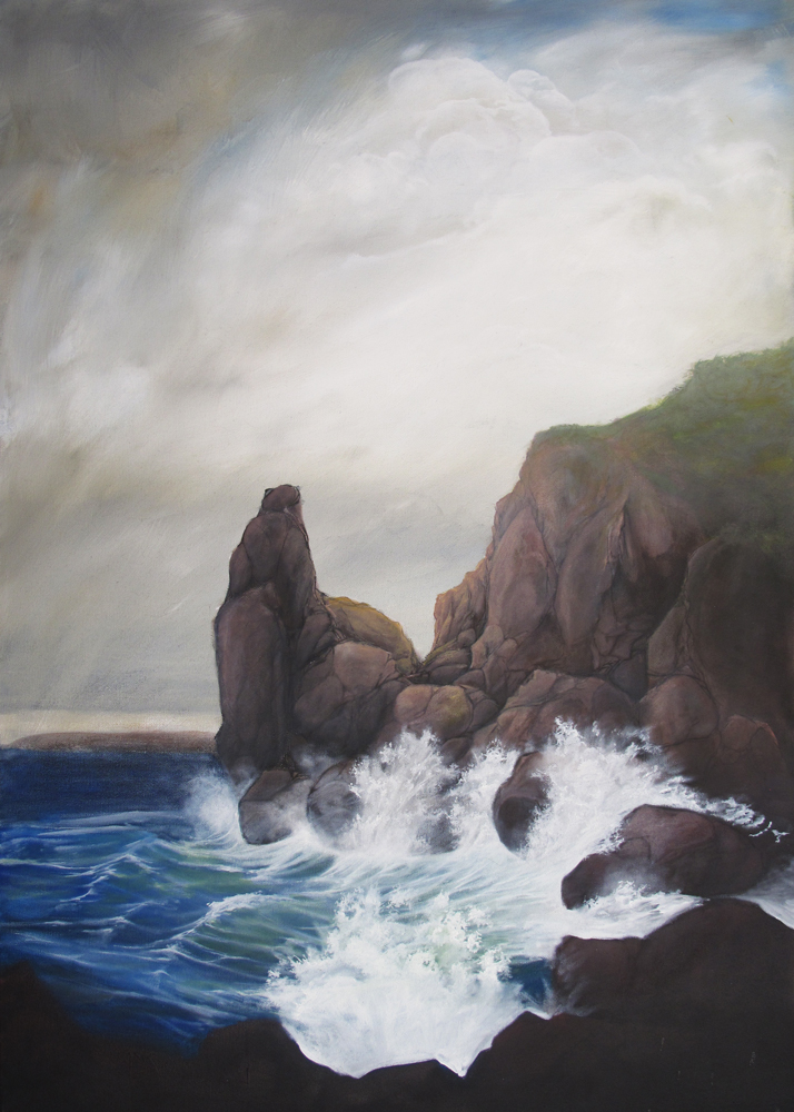
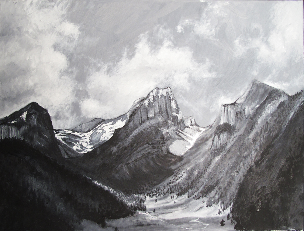
- analog
- pen
- pencil
- color pencil
- oil
- acrylic
- litho
- charchoal
- digital
- photoshop
- illustrator
lettering
- hand lettering
- calligraphy
- pen
- brush pen
- markers
- photoshop
- illustraotor
< prev
close
next >
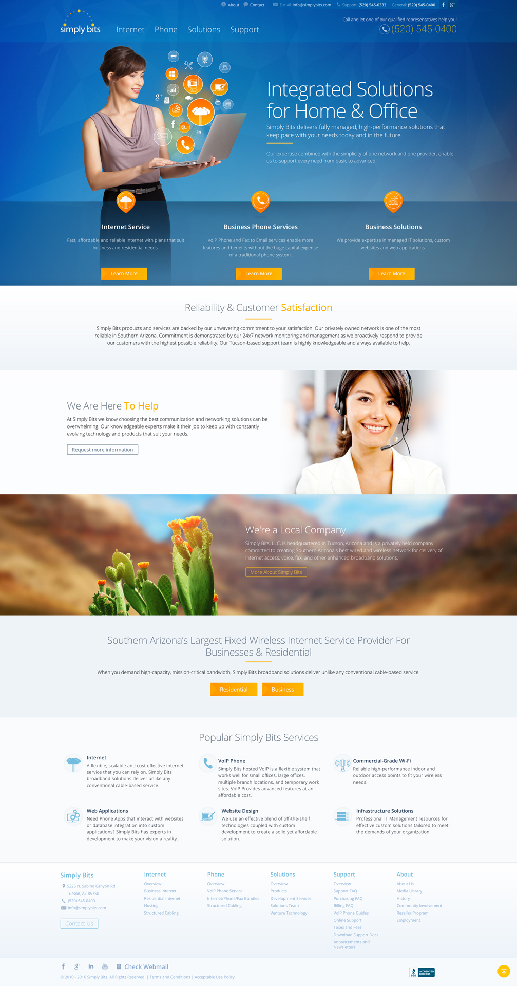
website
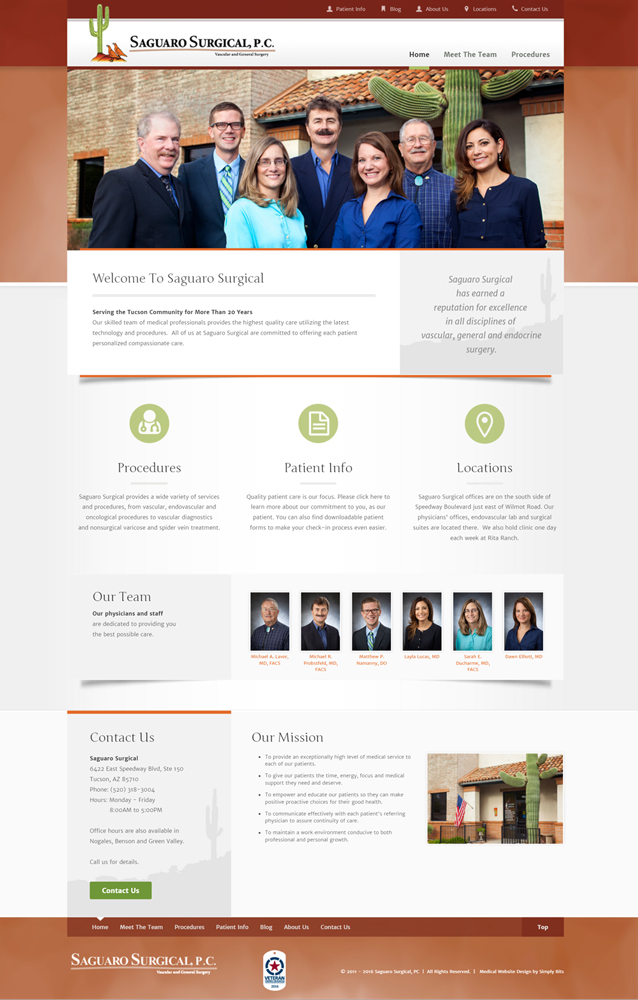
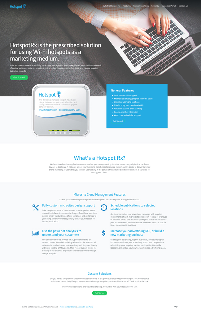
Building a website that is visually appealing while maintaining the needs and goals of a business: The Simply Bits site was one of my favorite projects to be a part of.
Built with the Sitefinity CMS, this website consists of more than 70 pages. Working in a team of four (two developers and two designers), this was a year-long project beginning in 2014. I primarily worked on the visual design elements, UI, site features, technical documentation design/management, template design/management, testing and some light frontend work.
The project started with some experiential mocks, pushing the company’s brand and image to its limits after each alteration. Not only did the structure and style of the website need to be changed, but the perception management of a tech company of this type needed adjusting. What was the best way to visually communicate the goals of a company with a wide variety of interconnected services?
Finding images that best assisted the majority of the company’s complex technical services was a challenge. After days of attempting to use existing stock images and icons, I decided to create a complete icon set for every service and feature of the business. What started as three primary icons became a set of more than 40 icons with three color variations and styles. These new icons were not only restricted to web use, as I also created a consistent brand through-line across marketing materials and technical documentation.
The colors changed from dark, sleek and sincere to a lighter, uplifting, active and cool color scheme. With the new blue, orange, red-orange and varying light, cool greys, visual elements were assigned different levels of hierarchy with color intensity, value and contrast, while avoiding element competition for a clear hierarchical structure. Blue-colored elements were pushed back while white and light grey elements became secondary. The intensity of the orange was then used to push primary elements forward. These colors were maintained throughout all updated technical and marketing documents. A background polygonal geometric pattern was also created for all branding applications.
more...
Tools
- html
- css
- jquery
- js
- telirek
- kendo
- sitefinity
- visual studio
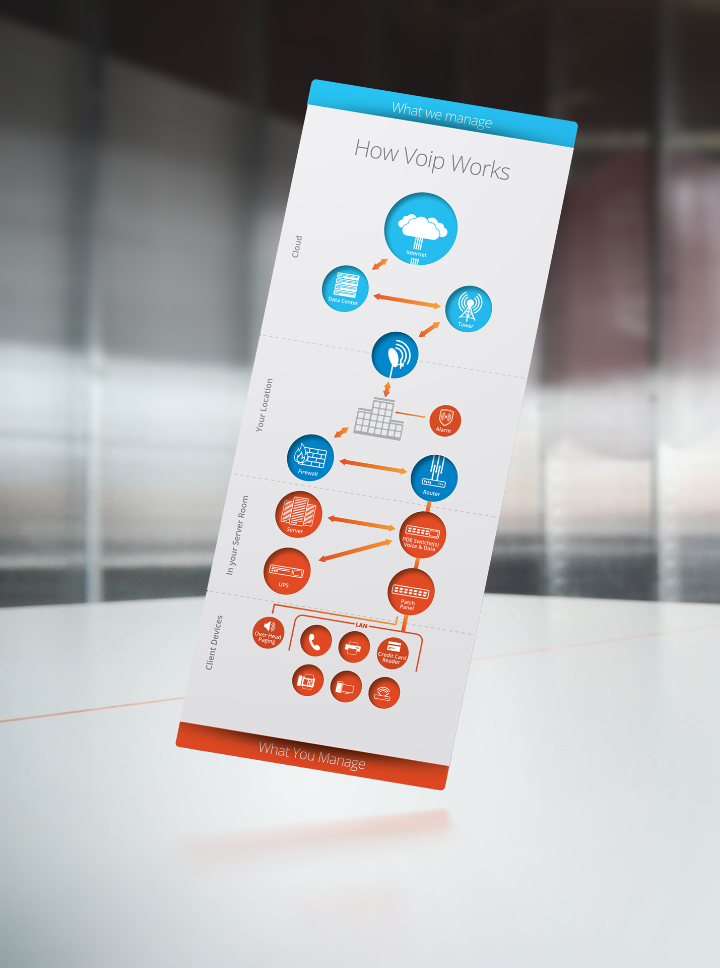
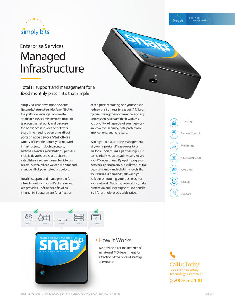
The interactive trifold: This document is one of the more memorable and challenging projects I was involved in.
What began as a design update to improve a document grew into a complex trifold that provided a simple visual explanation of a complex enterprise service structure. We began by talking about what the department needed and wanted. I asked for the sales rep to present this document to me the way they would to a new (non-technical) client to see how they interact with the document during conversations. What value and information did the relationships between icons provide?
A cleaned up and refined traditional trifold was what they had in mind. I knew I could build what they wanted – and I did. In the process of building the first option, I had a problem. I had difficulty understanding the explanation of services by the sales rep. I could understand the basic process (which was represented with icons and arrows), but I could not visualize what the client currently managed, what we currently manage, and what we could also manage (which was explained with a combination of literal and gestural circles over an already busy document).
Along with the suggested option, I started working on an alternative design. I wanted to show multiple relationships without having to resort to repeating or overlaying multiple graphics.
As I began my testing, I didn’t want the client to focus too much on the design, so I restricted conversations to only the information that the printout would need to provide. I did, however, present the design to individuals who had no idea about these services, having them hold and interact with the trifold. Their input on the amount of information the design provided was very valuable and greatly influenced the outcome of the document. These were the individuals who were going to benefit the most from a tool such as this.
After a few experiential mocks, I felt like I had a solution. The document had become a tool, using three sheets of paper to create two insets and a single wrapping sleeve. Both inserts were full-bleed prints on the heaviest matte stock I could run though the office printer. I made one insert blue for services provided and managed, another insert orange for client-managed services, and the main sleeve was a full-bleed print on medium gloss with window cutouts to expose the colored icons of the inserts.
more...
Tools
- prepress prep
- brochures
- marketing material
- technical documents
- diecut
- illustrator
illustration
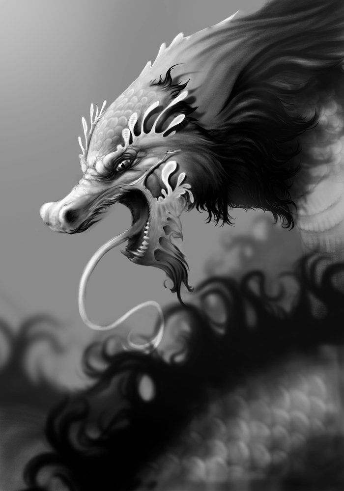
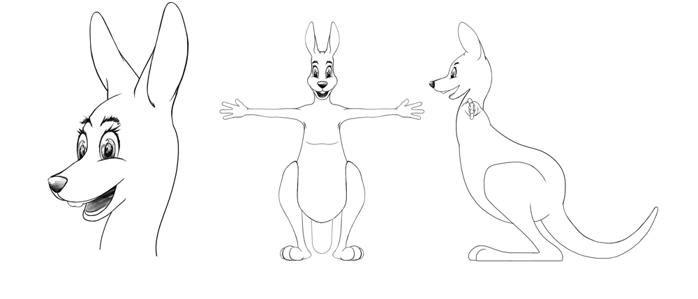
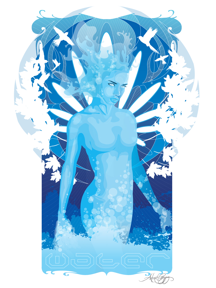
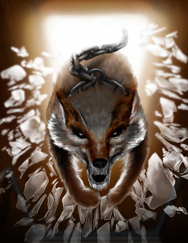
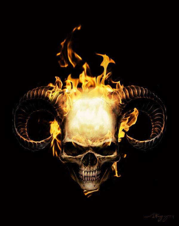
Although my last major illustration project was in 2015. I still rely on creating custom illustrations and graphics when working on higher-end websites and prints.
This illustration was completed in 2015 for a custom motorcycle garage that wanted a custom large graphic for their printing needs. We began by talking about the image’s use, tone, style and composition. After our conversations, I began sketching.
I provided six sketches, two for what the client described and four alternative and experimental ideas. Each provided different expressions, bone structures (from realistic to exaggerated features), flame amount, horn style and head tilt. In the review meeting, we focused on the elements and features the client liked best. Then I combined those key elements to create three new options, one of which would be refined as the finished piece.
At this point the illustration was gray scale and I had yet to add color. Although the illustration was created in Photoshop, I planned to approach this project in a traditional painting technique, beginning with dead coloring in the bottom layer and colored layer above. Since this illustration was heavy in darks, I wanted to retain many of the base values. With the color layer disabled, the bottom dead coloring layer gave me the ability to monitor the value levels.
The finished illustration is a 300dpi 4000 x 5000 px image, complete with independent color, flame and background layers.
more...
Tools
- photoshop
- sketchbook pro
- surface pro
lettering & calligraphy
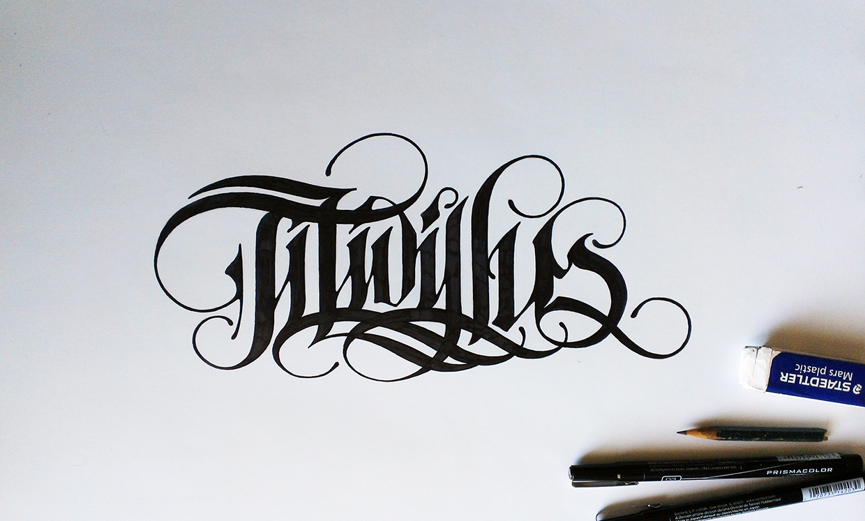
In my spare time I like to move away from the computer and focus on analog techniques: calligraphy, lettering, gestures, pencil, pen and charcoal. Pretty much anything I can afford to do and find supplies for.
This was a personal project. Hand lettering created with pen in a modified blackletter typeface. Titivilus. I stumbled across this name while reading about medieval calligraphy and bios of the calligraphic robot. Calligraphers would blame their mistakes on a demon named Titvillus. The inspiration was there, but the knowledge was not, and this was one of the first times I had attempted hand lettering, aside from experimental sketches and small-scale works.
The learning process was a bit different than what I was used to. There is no documentation or clear explanations of technique, but there were lots of visual references of other works. It was something I wanted to reproduce and accomplish, so I began my research.
I focused on one type face style. I did, and do, have previous experience and education in typography, so I observed the exaggerations of characters, line breaks and features that gave these words coloring, as well as when and where to break typographic rules and opportunities to exaggerate typographic features.
I took my time, testing out different layouts and typographic treatments before I committed to the final piece. Through the process, I learned the distinctions between hand lettering and calligraphy, and found hand lettering to be more forgiving. It doesn’t stop me from practicing calligraphy, though, as I enjoy the extra challenge.
more...
Tools
- hand lettering
- pen
- markers
More Works